তোমার ডিজাইন ব্যবহার করার সময় ব্যবহারকারীর মনে যা যা ঘটে বা ঘটতে পারে তার সবই খুব গুরুত্বপূর্ণ । শুধু তা’ই নয়, ব্যবহারের আগে এবং পরে যা ঘটে তাও খুব গুরুত্বপূর্ণ
অধৈর্য হইওনা! এখন আপাতত মনস্তত্ত্বর খুব প্রাথমিক কিছু ব্যাপার নিয়ে আলোচনা করি । খুব অল্প সময় নিব । প্রমিজ ।
প্রেমের মনস্তত্ত্ব, ভোগ্যপণ্য ব্যবহারকারীর মনস্তত্ত্ব, অথবা বাথরুম মনস্তত্ত্ব, যা-ই বল না কেন সেই একই মস্তিস্ক নিয়েই আমরা কথা বলছি ।
এটাতে আলাদা করে “ব্যবহারকারী” অংশ বলে কিছু নেই ।
ইউএক্স ডিজাইন মস্তিষ্ককে বেশ ভাল ভাবেই প্রভাবিত করতে পারে । আর সেটাই তুমি শিখতে যাচ্ছ: ডিজাইনের দৃষ্টিকোণ থেকে তোমার মস্তিষ্কের কার্য পদ্ধতি । আমরা যা শিখব তা’ হাতে-কলমে শেখার চেষ্টা করব । গুরুত্বপূর্ণ না হলে ইতিহাস চর্বণের ধারে কাছেও যাব না । দার্শনিক কোন কিছু তো নেই-ই এখানে । সিগমুন্ড ফ্রয়েড আমাদের ত্রি-সীমানায় ঘেষতে পারবে না । কারণ গাঁজা খুব একটা স্বাস্থ্যকর বা গ্রহণযোগ্য বিষয় না আমাদের জন্য ।
শুধু সেই সব বিষয় নিয়েই কথা বলব যা আমরা আমাদের কাজে ব্যবহার করতে পারমনস্তত্ত্ব জানা প্রয়োজনীয় কসাফ কথা: মনস্তত্ত্ব না জানলে তুমি ইউএক্স ডিজাইনার হতে পারবে না । সে-রা-রা-রাম, রকস্টার হওয়া তো পরের কথা! শর্ত আগেই বলে দিলাম । পরে কপাল চাপড়িও না ।
ইউএক্স হলো এমন একটি প্রয়োগিক বিদ্যা যা সমস্যা সমাধানের সুশৃঙ্খল পদ্ধতি প্রয়োগ করে অনেকগুলো সম্ভাবনাময় সমাধান থেকে সবচেয়ে উপযুক্ত আর সেরা সমাধানটি বাস্তবে রূপান্তর করে । মানে হলো, নিজে থেকেই ব্যবহারকারী যাতে অনুভব করে, চিন্তা করে, এবং কাজটি করে সেটা নিশ্চিত করা এবং উদ্বুদ্ধ করা । ফলে ব্যবহারকারীর অনুভূতি, তাদের চিন্তা ধারণা, এবং কি করলে কাজটি অনায়াসে করবে তা যত বেশি বেশি জানবে তুমি ততই কাজে সাফল্য পাবে এবং ভাল ডিজাইনার হিসেবে খ্যাতি অর্জন করবে । ইউ উইল রক বেবি!
মনস্তত্ত্ব বুঝলে তুমি বুঝতে পারবে মানুষ কেন একে অপরের সাথে শেয়ার করে ( গার্লফ্রেন্ডের দেয়া ছাগলের ছবির শেয়ার দিয়েছ কেন তা’ও বুঝতে পারবে) । অথবা কেন তারা সব সময় সবচেয়ে সস্তা অপশনিটি* বাছাই করে না? অথবা মেরে দেয়া বস্তা পঁচা ডিজাইন হওয়া সত্ত্বেও কেন ড্রিবলে ২০০০ লাইক পায়? হুম, এ সবই সম্ভব বাস্তব জীবনে !
উত্তরগুলো জানলে তুমি সত্যিই আশ্চর্য হবে । তোমার ইনটিউশন বা সহজজ্ঞান সব সময়ই তোমার সাথে মিরজাফরী করে, আমার সাথে, যদিও সবার সাথেই করে । (এটা সম্বন্ধে পরবর্তী একটা অধ্যায়ে আমরা আরো জানব) এবং অনেক সময় একই ডিজাইন একেক জনের কাছে সম্পূর্ণ ভিন্ন ভিন্ন লাগে । তুমি এ ব্যাপারেও জানতে পারবে । ধৈর্য্য বৎস ধৈর্য্য । মাঝে মাঝে কোন কিছু তোমার কাছে একান্তই ব্যক্তিগত মনে হলেও আসলে সবার জন্যই তা প্রযোয্য । যেমন, নতুন ক্র্যশকে সব সময়ই টম ক্রুজের মতো হ্যান্ডসাম বা ঐশ্বরিয়া রায়ের মতো সুন্দরী মনে হয় । গায়ের রং, চেহারা যাই হোক না কেন । হলোই বা তার মাথার অর্ধেক চুল পাকা! এসব বিষয়েও আমরা পরবর্তীতে কোন এক অধ্যায়ে জানতে পারব (যদি ততদিন লেখার ইচ্ছা থাকে) !
* Option – অনেকগুলো পছ্ন্দ থেকে ১টিকে বাছাই করা । ধর একসাথে ৩ টি মেয়ের উপর ক্র্যাশ তোমার । কোনটা রেখে কোনটাকে গার্লফ্রেন্ডর বানাবে, এই যে ব্যাপারটা, এইটাই অপশন । তোমার এখন ৩টি অপশন আছে । তুমি তিনটিই রাখতে পার, আবার ১টি বা ২টি ও রাখতে পার (একাধিন না রাখাই ভাল)!
মানুষের কিছু আচরণ সহজই অনুমান করা যায় । কতগুলো আবার সহজে অনুমান করা যায় না । এ অধ্যায়ে মানুষের আচরণের কোন অংশ তুমি নিয়ন্ত্রণ করতে পারবে আর কোন অংশগুলো পারবে না তা নিয়ে আলোচনা করব ।
মনস্তত্ত্ব
আমরা সবাই কম-বেশি প্রায় একই রকম মস্তিষ্ক নিয়ে জন্মগ্রহণ করি । খুঁটি-নাটি অনেক কিছুই হয়ত পার্থক্য বের করা যাবে কিন্তু মোদ্দাকথায় মোটামুটি একই রকম একটি যণ্ত্র ঘাড়ের উপর আমরা সবাই বহন করে চলেছি ।
সুখ-দুঃখের অনুভব সবারই আছে । সবাই সম্মান চাই । বাইসাইকেল চালানো শিখতে চাই আবার আগের রাতে পার্টিতে খাওয়া টাকিলা শটের জন্য অনুশোচনাও করি । উদাহরণ স্বরূপ, Pinterest.com তৈরী হয়েছে একটি বিশেষ মনস্তত্ত্বকে অবলম্বন করে । আমরা সবাই জিনিষপত্র সংগ্রহ কর রাখতে পছন্দ করি । কেউ ডাকটিকেট, কেউ পয়সা আর কেউ বা কাগজের নোট । এটা সব মানুষের ক্ষেত্রেই প্রযোয্য । আমরা সবাই কিছু না কিছু সংগ্রহ করতে চাই ।
এই ক্ষেত্রে মনস্তত্ত্ব সবার জন্য সমান ভাবে কাজ করে । পরবর্তী লেখাগুলোতে মূলত এই মনস্তত্ত্ব নিয়েই জানব । আমরা সবাই এই সব বিষয়ে একই রকম আচরণ করি । এ বিষয়গুলো সবার ক্ষেত্রেই সমান ভাবে প্রযোয্য । তুমি এগুলো শিখতে পার এবং তোমার ডিজাইন বা সমস্যার সমাধানে কাজে লাগাতে পার ।
কারো কারো ক্ষেত্রে এই একই মনস্তত্ত্ব অন্যভাবে কাজ করে । সেটাও আমাদের একেবারে ভুলে গেলে চলবে না । মোট কথা, বাঁচতে হলে জানতে হবে ।
সংস্কৃতি
জন্মের পর আমরা আমদের মস্তিষ্ককে এক এক জন এক এক পথে নিয়ে যাই । কেউ হয়ত পদার্থ বিজ্ঞানে সর্ব্বোচ্চ ডিগ্রী নিয়ে ব্যাংকে টাকা গুনার কাজ নিয়েছে । কেউ হয়তো কলেজ বিশ্ববিদ্যালয়ে না গিয়েই জ্ঞান বিতরণ করছে । কেউবা এক পা নিয়ে রিক্সা চালিয়ে সংসার চালাচ্ছে । কেউ হয়ত চার হাত পা নিয়ে অফিসার হয়ে মানুষকে বিপদে ফেলার ধান্ধা করছে! কেউবা আবার মাদ্রাসায় আরবী পড়াশোনা করে খ্রিস্টান সমাজের মানুষের উপকার করে বেড়াচ্ছে ইত্যাদি ইত্যাদি আরো কত কি!
আরো উদাহরণ দিলে ব্যপারটা ভালভাবে বুঝা যাবে । সবাই সুবিচার চায় । কিন্তু কেউ হয়তো শাস্তি হিসেবে মৃত্যুদন্ডকে উপযুক্ত মনে করে আবার কেউ কেউ ভিন্ন মত পোষণ করে । অথবা পিন্টারেস্টের উদাহরণটা যদি আরো বাড়িয়ে বলি: “সংগ্রহ করা” হয়তো সমস্ত মানব সমাজের ধর্ম, সবাই সংগ্রহ করতে চায় । কিন্তু কে কি সংগ্রহ করবে তা একান্তই ব্যক্তিগত । পিন্টারেস্ট তাদের প্রত্যেক ব্যবহারকারীর আগ্রহের বিষয় খুঁজে বের করতে চেষ্টা করে । কেউ হয়তো ডিজাইন সংগ্রহ করতে চায়, কেউ হয়তো বিল্ডিং এর ছবি, আবার কেউ হয়তো নাদুস নুদুস কিউটি বিড়ালের ছবি সংগ্রহ করে রাখতে পছন্দ করে ।
সংস্কৃতি, এই অর্থে আমাদের প্রত্যেকের জন্য ভিন্ন ভিন্ন । একই ধরণের অভিজ্ঞতাসম্পন্ন এবং ব্যক্তিত্বের মানুষের সংস্কৃতিও প্রায় একই রকম হওয়াটা স্বাভাবিক কিন্তু ব্যক্তিগতভাবে নির্দিষ্ট কোন সংস্কৃতি নেই । যে কোন কিছুই হতে পারে । এ ব্যাপারে আগাম ধারণা করা সম্ভব নয় ।
দু’টোর পার্থক্য
মনস্তাত্ত্বিক বিষয়গুলো-যেমন তুমি যা পছন্দ কর তা সংগ্রহ করা-সময়ের সাথে সাথে এগুলো অভ্যাসে পরিণত হয় । তখন এটাকে বলা হয় “নিখুঁত” ফিচার । এগুলো সাধারণ উদ্দেশ্যে খুব সহজে করা যায় এমনভাবে তৈরী করা হয় কিন্তু এগুলোই সবচেয়ে বেশি প্রভাব ফেলে ।
সংস্কৃতির বিষয়গুলো-যেমন তোমার আগ্রহের বিষয়-সময়ের সাথে সাথে এগুলোর জন্য বাড়তি কিছু লাগবে । হতে পারে নিজের মতো করে সাজানো বা বিভিন্ন ধরণ অনুযায়ী সাজানো । এগুলোকে অপটিমাইজ* করা যাবে না, কিন্তু কাস্টমাইজ** করার সুযোগ থাকে । এগুলোর উদ্দেশ্য আরো পুঙ্খানুপুঙ্খ, কিন্তু বাড়তেই থাকে সময়ের সাথে সাথে । তোমার বিড়ালের ছবিগুলো বিভিন্ন ভাবে সাজানো যেতে পারে, যেমন কাল বিড়াল, বাচ্চা বিড়ার, হুলো বিড়াল, জংলী বিড়াল, মোটা বিড়াল, শুকনা বিড়াল, প্রতিবেশির বিড়াল, প্রতিবেশি ঐ মেয়েটির বিড়ালের ছবি ইত্যাদি ইত্যাদি । এর কোন শেষ নেই । এবং যতই সময় যাবে ততই এগুলো বাড়তে থাকবে ।
এই বিষগুলো মনে রাখ, কারণ পরবর্তী সব লেখায় এগুলোর উপর ভিত্তি করে আমাদের ইউএক্স জ্ঞান এবং ধারণাকে আরো পোক্ত করব ।
* Optimize – অপটিমাইজ – কোন কিছু সবেচেয়ে দ্রুত গতিতে ও ভালভাবে করা । যেমন, একটি কাজ করতে তোমার লাগে ২ ঘন্টা, ঠিক সে কাজটি একই পরিবেশে, একই উপকরণ দিয়ে করতে তোমার বন্ধুর লাগে মাত্র ৩০ মিনিট । এখানে তোমার বন্ধু তোমার চেয়ে অপটিমাইজ ভাবে কাজটি করে ।
* Customize – কাস্টমাইজ- কোন কিছুর নিজের মতো করে সাজানো । তোমার পড়ার বা কাজের টেবিল ঠিক তোমার মনের মতো করে সাজানো। তোমার মা সেটাকে গুছিয়ে রাখলে কিছুই খুঁজে পাও না সেখানে। তোমার বন্ধুর টেবিল তার মনের মতো করে সাজানো থাকে যদিও টেবিল, টেবিলের উপরের উপকরণ সাধারণ একই ধরণের থাকে । একেই বলে কাস্টমাইজ ।
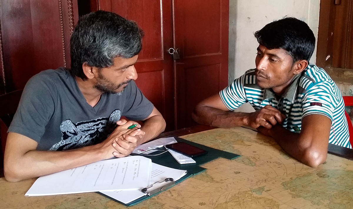
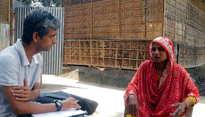
এ ধরণের সাক্ষাৎকার নেয়া হয় সাধারণত ব্যবহারকারীর বাড়ীতে বা যেখানে যে অবস্থায় ব্যবহার করা হবে ঠিক সে জায়গায় । বর্তমান বা ভবিষ্যতের কোন ফিচার নিয়ে ১-২ ঘন্টা ব্যাপী স্থায়ী হয় এ সাক্ষাৎকার । উদাহরণস্বরূপ বলা যেতে পারে, আমি কৃষকদের একটি মোবাইল সেবা নিয়ে সাক্ষৎকার নিয়েছিলাম তাদের বাড়িতে বা জমিতে বসে ।
এ ধরণের সাক্ষাৎকারের উদ্দেশ্য হলো, সম্পৃক্ত ব্যক্তির জীবন,সিদ্ধান্ত নেয়ার পদ্ধতি এবং বাধাসমূহ সম্পর্কে যতটা সম্ভব গভীরভাবে জানা এবং বুঝা । সাধারণত দুই কারণে সাক্ষাৎকার নেয়া হয়: প্রথমত, মানুষ কি কি সমস্যার সম্মুখীন হচ্ছে এবং সেগুলো কিভাবে সমাধান করছে তা থেকে অনুপ্রাণিত হওয়া; দ্বিতীয়ত, তার আবেগ-অনুভূতির সাথে একাত্ম হওয়া বা এ্যমপেথি তৈরী করা ।
তোমার উদ্দেশ্য হলো তাদের চোখে পৃথিবীকে দেখা ।
সাক্ষাৎকারের ক্ষেত্রে সাক্ষাৎকার গ্রহণকারী আর প্রদানকারীর অনুপাত ২:১ বা সর্ব্বোচ্চ ৩:১ হওয়া উচিত । এর বেশি হলে প্রদানকারী বিচলিত অনুভব করতে পারে এবং সে তোমার সাথে সহজ হয়ে কথা বলতে বা সৌহার্দ্যপূর্ণ সম্পর্ক তৈরী করতে ব্যর্থ হতে পারে । ফলে তার থেকে সঠিক ও প্রয়োজনীয় আশানুরুপ তথ্য নাও পাওয়া যেতে পারে ।
সাক্ষাৎকার হলো কথোপকথন-তুমি অবশ্যই আগে থেকে একটি প্রশ্নমালা তৈরী করে নিয়ে যাবে । “ডিসকাশন গাইড” তৈরী করবে । সেখানে কোন বিষয়ে কতক্ষণ কথা বলবে তার উল্লেখ থাকবে । তোমার সব প্রশ্ন বা আলোচনার বিষয় যৌক্তিক আকারে একটার পর একটা থাকবে । হঠাৎ করে আলোচনার বিষয় যাতে সম্পূর্ণ ভিন্ন দিকে চলে না যায় সে দিকে খেয়াল রাখবে ।
ইউএক্স ডিজাইনাররা বেশিরভাগ সময় অন্য সবার এবং সব পরিস্থিতির বা প্রজেক্টের কেন্দ্রবিন্দুতে অবস্থান করে । ক্রসফায়ার অবস্থান যাকে বলে আর কি ! ফলে সব সময় তোমাকে প্রস্তুত থাকতে হবে রুম ভর্তি এক গাদা হুমড়া-চোমড়া লোককে তোমার ডিজাইনটি খাওয়ানোর জন্য, মানে তোমাকে বোঝাতে হবে এটাই সঠিক এবং শ্রেষ্ঠ ডিজাইন । এবং শ্রেষ্ঠতা বোঝানোর জন্য তোমার কাছে যথেষ্ঠ তথ্য ও প্রমাণ থাকতে হবে । সত্যিকার ইউএক্স ডিজাইনাররা অনুমান করে কখনও কিছু বলে না বা করে না ।
আগের অধ্যায়ে আমরা জেনেছি যে কোম্পানির গুরুত্বপূর্ণ ব্যক্তি বা স্টেকহোল্ডারদের কাছ থেকে রিকয়্যারমেন্ট যোগাড় করতে হবে ।
কিন্তু তোমার নিজের যোগানো তথ্যও আলোচনায় আনতে হবে । অন্য যে কারও তোমার শ্রেষ্ঠ ডিজাইনের ব্যাপারে দ্বিমত থাকতেই পারে । কিন্তু তথ্য প্রমাণ দিয়ে তাকে বোঝাতে হবে অন্য যে কোন ডিজইন থেকে এটা কেন ভাল । অন্যথায় তাদের কি দায় পড়েছে তোমার মনের মাধুরী মেশানো ডিজাইন পছন্দ করার ?
ইউএক্স ডিজাইনার হিসেবে তোমার কাজ হলো কোন কিছু ডিজাইন করার আগেই তোমার ডিজাইনের পক্ষে কি কি যুক্তি আছে তা নিশ্চিত করা । তাহলেই তুমি তোমার আইডিয়াকে প্রতিষ্ঠা করতে পারবে ।
তোমাকে প্রমাণ করতে হবে যে তুমি সঠিক পথেই যাচ্ছ ! প্রথমত নিজের কাছে দ্বিতীয়ত অন্য সকলের কাছে ।
বাঁচতে হলে জানতে হবে
সফল গবেষণা, ভাল তত্ত্ব, এবং ভাল তথ্য নিজেই নিজেকে বোধযোগ্য করে তুলে । ভাল গবেষণা করে, ব্যবহারকারীদেরকে সম্পূর্ণরূপে বুঝে, তাদের সমস্যা ও লক্ষ্য চিহ্নিত করে সময় ও ধৈর্য্য নিয়ে স্টেকহোল্ডারদের তোমার সমাধানের গুরুত্বের ব্যাপারে যুক্তি দেখাবে । শুরুর দিকে তোমার সমাধানের ব্যাপারে প্রশ্ন থাকলেও এগুলো তাদের তোমার সমাধান ভালভাবে বুঝতে ও অনুধাবন করতে সহায়তা করবে ।
এবং যখনই এমন কোন বিষয় আসবে যা সম্পর্কে নিশ্চিত না, যেমন ব্যবহাকারী (কৃষক বা ছাত্র) কোন রংয়ের বাটন পছন্দ করবে, তখনই এটা নিয়ে পরীক্ষা-নিরিক্ষার জন্য প্রস্তুত থাকবে । পরবর্তী অধ্যায়ে আমরা এসব মনস্তত্ত্ব এবং সংস্কৃতি বিষয়ে আরো জানবো ।
প্রতিজ্ঞা কর: ইউএক্স নিয়ে আমি কখনই, কোন অবস্থাতেই মিথ্যা তথ্য দিব না
যদি কোন প্রশ্নের উত্তর না জান তবে বল “আমি এ ব্যাপারে এখনও জানি না এবং খুব শীঘ্রই জানব” ।
ইউএক্সে “ধর তক্তা মার পেরেক” এর কোন জায়গা নেই । আর এটা করেছ তো মরেছ । নিজের পায়ে কোড়াল মারা যাকে বলে ।
ইউএক্স সম্বন্ধে ইত্যিমধ্যেই অনেকের অনেক ভুল ধারণা আছে । ইন্টারফেস ডিজাইনার মনেই ইউএক্স ডিজাইনার, ফটোশপ আর ইলাস্ট্রেটর পারলেই ইউএক্স ডিজাইনার এমন ধারণা প্রায় সবার মধ্যেই বিরাজমান । এর উপর তুমি যদি ভুল তথ্য দাও সেটা পরিস্থিতিকে এবং ইউএক্স সম্পর্কে আরো খারাপ ধারণা তৈরী করবে । নিজের কবর খোড়ার মতো ব্যাপার আর কি !
আর তুমি ভুল বললে শুধু তোমাকে একা খারাপ ভাববে তা না, সমস্ত ইউএক্স ডিজাইনাদের সম্পর্কেই নেতিবাচক ধারণা তৈরী হবে। তোমার মতামত হয়তো অন্য কারো মতামত থেকে ভাল না কিন্তু তুমি যে তথ্য দিবে তা যেন সঠিক এবং অন্য আর কেউ দিতে না পারে । এটা নিশ্চিত করতে পারলেই তুমি এবং তোমার জাত ভাইদের মঙ্গল হবে, মান ইজ্জত থাকবে, এবং পেটে-ভাতে খেয়ে বাঁচতে পারবে । আর তুমি নিশ্চয়ই কারো পেটে লাত্থি দিতে চাও না !
ইউএক্স ডিজাইনে সমস্যা সমাধানের ক্ষেত্রে তুমি কি করতে পারবে না এবং অবশ্যই কি করবে এই দুটো যত বেশি বুঝতে পারবে ততই ভাল হবে তোমার চূড়ান্ত ডিজাইনটি বা সমাধানটি ।
বেশিরভাগ ক্ষেত্রেই ডিজাইন প্রসেসের উদ্দেশ্য হলো যত বেশি সম্ভব ইন্সপিরেশন বা অনুপ্রেরণা এবং আইডিয়া যোগানো । মোড বোর্ড । ফটো । আরো অনেক কিছু আছে এমন । শৈল্পিক সৃজনশীলতার কাজ হলো তোমাকে স্বাধীনভাবে চিন্তা করতে উদ্বুদ্ধ করা এবং সম্ভাবনা যাচাই করা ।
কিন্তু এভাবে সমস্যার সমাধানে খুব বেশিদূর আগানো যায় না । মানে এভাবে সমস্যার সঠিক সমাধান বের করা সম্ভব হয়ে উঠে না ।
কিন্তু ইউএক্স এ ব্যাপারটা ঘটে অন্য ভাবে । সমস্যাটি ভাল ভাবে বুঝতে গিয়ে তুমি যে সীমাবদ্ধতা এবং বাধা অনুধাবন করেছ সেখান থেকেই সবচেয়ে ভাল আর উপযুক্ত আইডিয়াটি বা সমাধানটি বের হবে ।
সেই সীমাবদ্ধতাগুলো তোমার সহকর্মী বা বস থেকেই আসুক অথবা আগের প্রজেক্টে কাজ করতে গিয়ে জেনেছ, সেগুলোই হলো “রিকয়্যারমেন্ট”* ।
রিকয়্যারমেন্ট তোমাকে ভুল করা থেকে বিরত রাখে
বাস্তব ক্ষেত্রে ইউএক্স কাজে তোমার কাজ কোম্পানির অন্যান্য অংশকে প্রভাবিত করে: বিক্রয় দল, প্রোগ্রামার, কার্যনির্বাহী, মোটামোটি অনেক কে । তোমার ডিজাইনের ফলে যে সব বিভাগের উপর প্রভাব পড়বে তার প্রত্যেকটার অন্তত একজন স্টেকহোল্ডারের** (গুরুত্বপূর্ণ ব্যক্তি) সাথে পূর্বেই আলোচনা সেরে নিবে ।
নিজ থেকে সমস্যা চিহ্নিত কর যেটার সমাধান করা সম্ভব । পণ্যের বা সেবার কোথায় পরিবর্তন আনা যেতে পারে, অথবা এমন কিছু চিন্তা কর যা অবশ্যই যোগ করতে হবে ।
বিক্রয় দলের দারকার এমন একটি সমাধান যা সহজেই বিক্রি করতে পারে । প্রোগ্রমাররা এমন প্রোগ্রাম লিখেছে যা পরিবর্তন করা কষ্ঠসাধ্য । নির্বাহিদের কিছু সুদূরপ্রসারী লক্ষ আছে যা অবশ্যই পূরণ করতে হবে । পিয়ন বা দারোয়ান, তারা হয়তো তোমার ডিজানের কারণে খুব বেশি প্রভাবিত হবে না কিন্তু তাদের গুরুত্ব না দিলে অফিসের অব্স্থা কি হবে আর ১০ মিনিট পর পর চা/কফির কে যোগান দিবে এ ব্যাপারে নিশ্চয়ই ধারণ করতে পারছ !
স্টেকহোল্ডারের সাথে যত বেশি কথা বলবে তত ভুল কম হবে, ফলে বেশি বেশি সময় এবং অর্থ বাঁচাতে পারবে । আর খুব শীঘ্রই তোমার চাকরি না যাওয়ারও সম্ভাবনা থাকবে ।
তুমি এখন একজন ইউএক্স ডিজাইনার; পরের প্রয়োজনই তোমার প্রয়োজন, পরের সমস্যাই তোমার সমস্যা । ফলে অন্যের প্রয়োজন বা সমস্যাকে নিজের মনে করে কাজ করতে হবে তোমাকে ।
স্টেকহোল্ডারদের কখনো সমাধান বা তাদের খায়েশ/ইচ্ছে জিজ্ঞেস করবে না
“রিকয়্যারমেন্ট” এবং “এক্সপেক্টেশন” বা “প্রত্যাশা” কে গুলিয়ে ফেলো না । দুইটা সম্পূর্ণ দুই বস্তু ।
যখনই কেউ বলবে আমার এটা প্রয়োজন, ওটা প্রয়োজন; মুখে এক সাগর হাঁসি নিয়ে জিজ্ঞেস কর কেন প্রয়োজন? উত্তরটিতে যখনই তুমি কোন এক্সপেক্টেশন বা মতামতের গন্ধ পাবে, আরো প্রশ্ন জিজ্ঞেস করতে থাকবে ।
কখনও কখনও কোম্পানিগুলো খারাপ সব আইডিয়া নিয়ে কাজ করতে থাকে কারণ তাদের ধারনা এর চেয়ে ভাল কোন কিছু করা সম্ভব না । অনেক অনেক অজাচিত আর অকাজের ফিচার যোগ করতে থাকে কারণ কেউ এসবের ব্যাপারে কখনও “না” শব্দটি উচ্চারণ করেনি । আর সফটওয়্যার তৈরীর ক্ষেত্রে বিশ্বব্যাপী একটি ভুল ধারণা কাজ করে, যত বেশি ফিচার তত ভাল । কিন্তু এর চেয়ে বড় ভুল ধারণা খুব কমই আছে ।
* Requirement – কোন প্রজেক্টের প্রয়োজনীয়তার বা যে সব সীমাবদ্ধতা থাকে তার তালিকা । যেমন ধর, চা খেতে গিয়ে তুমি যেমন বল মাম্মা, ৪ চামচ চিনি দিয়েন, পুদিনা পাতা আর আদা বাড়াইয়া দিয়েন । এ সবই চা এর রিকয়্যারমেন্ট । আবার আমার বস যেমন কখনও চিনি দিয়ে চা খান না । প্রথমেই চা ওয়ালা মামাকে এটা বরে দিতে হয় । (এখন থেকে রিকয়্যারমেন্ট ই ব্যবহার করব)
** Stakeholder – কোন একটা প্রজেক্টে যারা যারা জড়িত বা প্রোডাক্ট দ্বারা প্রভাবিত হবে । এমনকি যারা শুধুমাত্র অর্থ দিয়ে সাহায্য করবে তারাও । যারা অর্থ সাহায্য করছে, যে কোম্পানি কাজটি করছে, কোম্পানির যে যে কাজটির সাথে যুক্ত, ম্যানেজার, ডেভেলপার, ডিজাইনার, প্রোগ্রামার, টেস্টার, বাজারজাতকরণ দল এবং অবশ্যই ব্যবহারকারী স্টেকহোল্ডারের আওতায় পড়ে ।
Images of people, specifically, draw more attention than anything.
I already knew it. In social media, web pages, ads, articles with image gets more attraction or attention or hits compared without image. If that image contains real people, draw more attention than anything else. But wanted to burn it with another test.
Here is a statistics from Buffer about Twitter. Tweets with or without image comparison showing below graph:
Now, here is my experiment and result of same Facebook post which shows the impact between image and without image post.
Recently I’ve published a post about How to Conduct User Research. I post it in Facebook as soon as I published in my blog. That wast 48 hours ago. Here is the screenshot of that post and it’s “like” count.
While I am writing this article, 21 August, 2016, more than 48 hours have been passed after the post. But only 4 people liked it. Like rate per hour is 0.083. Notice that, I used image already in the post. The image doesn’t contain any people and doesn’t convey the story of whole article.
Here is another screenshot of the same post with an image.
Within one hour the post got 32 like. In the first hour “like” rate is 32 per hour. In the fifth hour, the like count was seventy plus. Average like per hour is around 15. I just used an image of two people talking, like an interview, which summaries the article contents and heading. Not just any image. It have people, related to the content. The image also tells the story of the context of the user research.
Only difference between these two post was image. Nothing else. I didn’t tested it without image though. But I think, that would also provide the same result with wrong image.
There is one other factor to consider about the situation. The first post was at Friday, all the office are closed and most people doesn’t see these type of serious post, may be. And the second post was today, Sunday, all the people are in office and can see these type of post. Certainly I am not saying that, people are not working and passing time in FB. But reading is always good.
Now some serious business…
Not any image you can use
Like any other contents in the web, images also have copyright. And you can’t use any image you want to use. If the image is taken by you, can use it anywhere you wish to. Other than your own image, you have to buy it or take permission from the image owner.
This is very serious. You could be sued if you get caught.
My rule above all else? Ask permission to use all images. If in doubt, don’t use the image!
Things to remember while user image
People prefer images over text
User image of real people
Images draw attention & trigger emotion
Combine photos and text to increase viewer retention and engagement.
Logos help users to orientate
Optimize your images so they load quickly.
Present information in visual formats, like infographics.
User meaningful images
Use high quality images to establish credibility.
Background images create atmosphere
Use images to support persuasive copy and in calls-to-action.
Don’t let graphics look like banner ads
Position your lead image to the right or left of the first paragraph in your post.
You can use one image per 350 words. Just saying.
Use ALT tag and add caption to your photos. It’s good for accessibility, SEO and your health.
Use Local images if applicable.
Use Images to Illustrate Concepts.
Optimize the File Size of Your Images
The average web page is 2099 KB. Images comprise 62% of a page’s total weight.
If you aren’t careful, your site’s dependence on images can actually make the user’s experience worse because it slows down their ability to engage with the site.
There are various free apps that can help you optimize the file size of your images. Here are some of them:
UX is a process. You design something. Take the solution to the users. Test the solution with real users; not the users them self. I am going to look into the complete process of testing a solution with the real users in the wild world of field research.
Background of the article / Learning the process aka the UX
I’ve been working at a project for more than last one and half year as an UX expert. Design giant Frog and GSMA is helping me to DO UX. They are guiding me to understand the problem properly, come up with hypothesis, proving those hypothesis right or wrong, coming up with as much solutions as possible, proving those ideas wrong (or right), filtering the best suitable idea(s), prototyping them to test, planning and conducting research with real users, synthesizing the findings, refining the solution, implementing the solution, testing the implemented solution with the users who are using, refining, monitoring, measuring and more again refining…cycle of the process. Practically I am learning the whole UX process. Recently I’ve conducted a user research with the live product for another iteration. I will try to discuss the process of user research step by step.
Why do we need another user research?
Two months ago we had a user test and in the following iteration workshop we found several issues that needs to understand more. Like why users are not happy with the price model, why users are not referring the service to others etc. We also had few hypotheses based on those issue which we need to prove right or wrong. As a result, we decided to understand those issues by conducting another in depth user test.
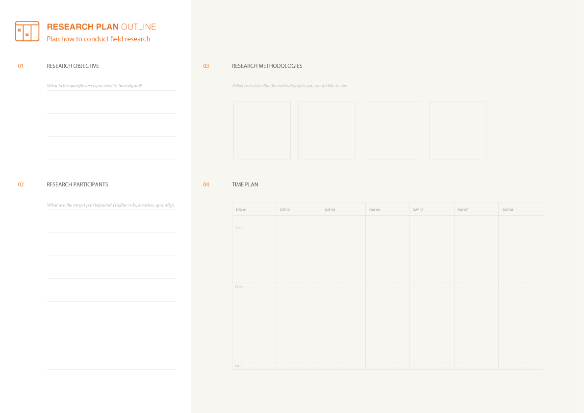
Planning
Whatever you do in UX, believe me, you have to plan ahead. As much detail as you could make is as much better. Here’s what you should include in the plan:
State the research objectives
Define hypothesis
Define your target participants
Define Place to conduct the research
Align partners or field facilitators
Define support needed from field
Define interview methods and tools
Define the schedule of the interview
Define your research team
Create Discussion Guide
Note-taking template
Day wise activity plan
Financial expenditure breakdown
Conduct the interview
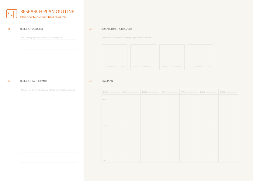
A sample research plan
Those may vary in project to project, situation to situation. All They are not have to have in a plan, but good to have at least these for a successful user research. Here I’ve tried to outline an ideal research plan components.
State the research objectives
Define and prioritize specific research objectives. These should be high-level questions area (e.g.”Evaluate the price model farmers are not happy with”). Usually three or four objectives with no more than one to two sub questions each are a good scope for a focused research session.
Define Hypothesis
Define and prioritize research hypothesis aligned with the objectives you already defined. The hypotheses drive the development of the discussion guide and will be proved or disproved through the research. Example hypotheses include: “Current price model was not accepted by majority of users because the service didn’t pride the value they are paying for”. Like objective, usually three or four hypotheses are good to have for a research session.
Define Your Target Participants
Discuss the type of participants you will seek to interview. Define users you want to interview. It will vary which stage at your service/product. If you are just starting the participants will be one kind. If you have a live service/product like me, you will have different type of participants. For my research I’ve chosen non-users, dropped out users and current users. You have to segment them in different types also, like male, female, literacy level, basic users, expert users etc. You also have to define which type of users ratio to meet your objectives and hypothesis
Define Place to conduct the research
Where you are going to conduct the user research or meet the users. This is depended on where your users are and match with target participants criteria. If you interview 20 people, you should consider moving around to talk with the people. And also you should consider where you stay to conduct the research. The nearer the best. I generally conduct the interview in the farmer house to feel the context properly.
Align partners or field facilitators
You may need to work with partners or field facilitators to collect you target participants. Align them at least 2 weeks ago so they could mobilize their people to get specific users based on participants criteria. They will take time based on the variety of the participants you want. Your partners or field facilitators are the only protector, companion, advisor and savior out there. Treat them as your own team member. Without them, you can’t succeed at the research.
Define support needed from field
You may don’t know the places you have to conduct the research. The participants place, what’s the condition of the road, safety, schedule of the interview and bring or going to the place etc. You will need their support to have a lunch out there. Surely with empty stomach you can’t have a great UX research. So, let them know upfront what kind of support you will need there, so they will be prepared.
Define interview methods and tools
Define the interview methods and pacing. Consider different interview methodologies, such as 2-hour in-depth interviews, short intercepts, market visits, Focus Group Discussion (FGD) and expert interviews.
Tools are used to discover user insights such as, which features is most valuable to the users.
Card Sort
Task Analysis
User Journey Map or Experience Map
Comics / Storyboard
Contextual Inquiry
Prototypes (lo & hi fidelity)
Customer Interview
Customer Observation
Define the schedule of the interview
Organize the schedule for field research. When setting up the schedule, consider user schedule and activities around that time depending on your user persona or archetype. In my case (as I work with farmers) I have to consider finding times during farm market days and avoid key harvest times when farmers are most busy. Make sure to include days for rest and synthesis in the schedule. I also had difficulties during week end as field facilitators take leave and farmers are not willing to talk. Consider those issues also while scheduling.
Define your research team
Define who should go into the field. UX is all about teamwork. Almost all successful UX have a very good team of various people working together. You have to spend days and night with your team. Team chemistry is very important for your success. Based on your project or situation, you have to build up your team. Try to have a mix of gender, age and language skills.Some one have to ask question, someone will take note of the answers given by users, and someone have to photograph, video graph, record the interview for later review. Which are vital for your synthesis.
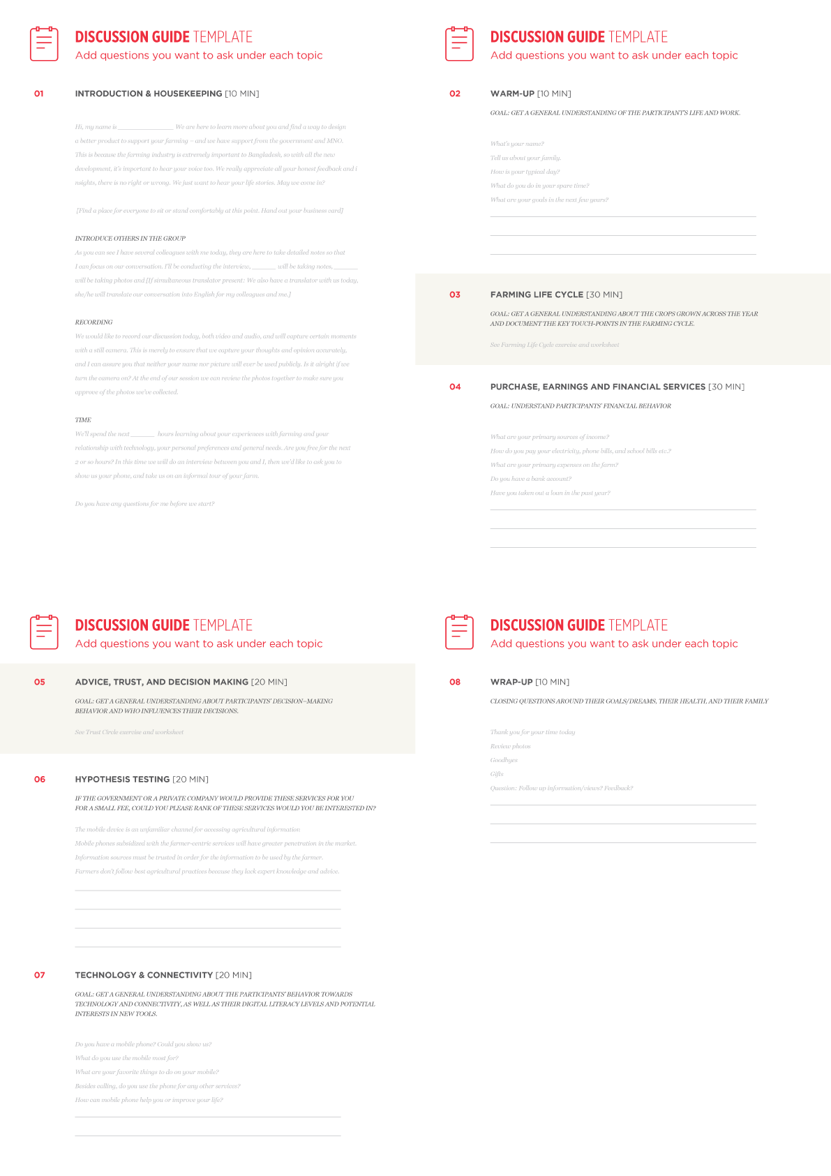
Create Discussion Guide
Outline topics, questions, and activities you plan to focus on during the interview. This is the lighthouse in the sea at night of your interview. You need to plan your interview minute by minute with your discussion guide. Where you will start to where you will end. Followings are the key things you should consider while creating your discussion guide:
List the key investigation areas
Start by listing the main areas you need to explore with each group of participants. Usually the interview is shaped around three to four main areas of exploration. Once you have identified them, assign an order, going from the high-level once and then gradually digging deeper into the topic.
Detail your questions for each investigation area
Focus on investigation area per time and list all the questions that come to your mind for that specific theme. Make sure the question encourage participants to share stories and not just answer “yes and no”.
Add hypothesis and assumptions
Consider the main objectives and hypotheses that your team have made and find ways to add them into the questions. Don’t be concerned when asking opinions and that way be wrong; it’s just a way to better articulate the conversations.
Design hands-on activities
Sometimes it’s hard to cover all the points you identify in the discussion guide with direct questions. Review your list of questions at the end and mark the ones that would need the support of physical stimuli to generate more effective discussion.
Sample discussion guide
Note taking template
Carefully note down what you observe in the field by using a predefined template for data collection and organization. Don’t rely on your memory every on this. Generally you will take several interview a day and you will forget many important points at the end of the day when you come back to synthesis. And forgetting a key point can ruin your product. Take note, whether it’s on a predefined template or anywhere, always. Trust me on this.
Day wise activity plan
Define your day wise activity from morning to night. You have to travel, prepare for interview, talk to user one after another, synthesis everyday evening when the memory is still fresh and you still remember the findings, you have to have enough rest, sleep to work next day. This will not work always as you plan, but it’s good to have an idea what’s next.
Sample day wise plan
Financial Expenditure Breakdown
This is not directly with the users but for you and your company you need to plan about financial needs you will require when you are in the field. You have travel cost, food cost, lodging cost, you should pay the user you interview for their travel and food if needed. You have to take enough money ideally 10-20% extra for emergency need. Your company also needs to justify and arrange money for the research. At least 1 or 2 week ahead you have to submit the your need so they could arrange it accordingly.
Conduct the interview
Have focused one-to-one conversations with selected participants to dig deep into their habits, needs, motivations, and behaviors.
Introduce yourself and the team
Introduce yourself and explain your research objectives to set clear expectations. Always check in to understand the participants is comfortable with the interview and try to build a context for the conversations before starting.
Approach the interview with structure
Enabling credibility is essential to set the right tone for the conversations. During the interview it’s important to cover all the aspects mentioned in the guide while remaining open and listening carefully, to shape the dialog around what the participant shares and says.
Ask why
Always ask why as a way to dig deeper into the answers and uncover hidden needs and motivations. Even when the participants might say something you expect, ask why to understand the key motivation behind his or her actions and answers.
Finish Politely
At the end of the interview thank the participant and offer a small gift to show appreciation for his or her time If you took photos, let the participant review the photos to make sure he or she is comfortable with them.
If you had a really good interview ask the participant if you could return in the future.
More things for user research
You will need few more things to consider before and at the field.
Your safety and health is very important to keep up.
Respect the culture of the area you are visiting.
While you are in user house or farm, be cautious about your behaviour and attitude.
Before you photograph, record conversations or capture video always take permission.
Take basic medicine with you.
Be cautious about food, some region prefer spicy food which your stomach might not tolerate and your whole user research could ruin.
Take with you enough stationery items like, printer, pens, markers, sticky notes, enough printed discussion guide, note-taking template, scissors, papers, writing board etc.
You should take female member in your team if the area is conservative and women’s are not willing to talk with a male interviewer.
Take a translator with you if the region talks with different language from your native language.
Drink enough water and take healthy food to keep up your energy.
And of course have fun with your work.
What’s next of user research?
Now you’ve conducted the interview and finished user research. You have lots of raw data like, notes, photos, videos and memory etc to work with. You have to carefully find out the key findings and come up with a summary report to present to the stakeholders you are working with. Generally it’s done in a presentation with all type of evidences you have with you. The summary should be as specific as possible and evidence based so when you preset you could answer the tough questions you will be asked by the audiences. You should tell your findings as story so viewers could easily understand the fact and context. UX is all about telling stories.
I hope you got a brief idea about how to conduct user research in the field. Please let me know your thoughts, questions, opinions, additional if you feel so. Next time we will talk about how to do Synthesis with these collected data and make sense of them.
প্রত্যেকটি ব্যবসা প্রতিষ্ঠানই ভিন্ন । প্রত্যেকটি টিমই* ই আলাদা । এবং প্রত্যেক ডিজাইনারও তার নিজের মতো । তাই তুমি কিভাবে কাজ কর এ ব্যাপারে জানা খুব গুরুত্বপূর্ণ ।
ডিজাইন নিয়ে কথা বলার সময় “প্রসেস” শব্দটি তুমি অনেক শুনবে । এমনকি এই লেখাতেও শব্দটি অনেকবার ব্যবহার করা হয়েছে ।
আমি হয়ত কখনও বলব, “প্রসেসের একেবারে শুরুর দিকেই ইউএক্স শুরু করা উচিত” অথবা “বৈজ্ঞানিক পদ্ধতির অনুসরণ খারাপ আইডিয়াকে বেশি দূর আগাতে দেয় না” অথবা “বসকে ফটোশপ করে আর্নল্ড সোয়ার্জনিগারের বডির সাথে তার মাথা বসানোর মাঝমাঝি পর্যায়ে আছি এখন” ইত্যাদি ইত্যাদি ।
তাই তোমাকে এটা সব সময় মনে রাখতে হবে এবং বুঝতে হবে যে, ইউএক্স একটি “প্রসেস” বা “পদ্ধতি” ।
ইউএক্স নির্দিষ্ট কোন ঘটনা বা কাজও না
কেউ যদি বলে যে ইউএক্স একবার মাত্র করলেই যথেষ্ঠ, বা প্রজেক্টের যে কোন একটা সময় করলেই হলো, বা যে কেউ একজন কোন রকমে করতে পারলেই হয়ে গেল তাহলে বুঝবে যে সে এখনো ইউএক্সে তোমার চেয়ে কাঁচা । হ্য় তাকে পাকানোর ব্যবস্থা কর নয়তো সটকে পড় । এ সবগুলোই ডাহা মিথ্যা কথা । আখেরে তুমিই বিপদে পড়বে ।
“যে ব্যক্তি কোন রকমে ইউএক্স -করে” সে ইউএক্স ডিজাইনার না । এটা অনেকটা পানির শুধুমাত্র ভিজা অংশটাকেই পানি বলে ধরে নেয়ার মতো ব্যাপার ।
প্রসেস না মেনে ইউএক্স করলে নিশ্চিতভাবেই তুমি একটা খারাপ ইউএক্স প্রসব করবে । “ইউএক্স ছাড়া” বিশ্বজগতে কিছু নেই । যত খারাপ জিনিষই হোক না কেন, তা তোমাকে কোন না কোন অভিজ্ঞতা দিবেই দিবে । খারাপ হোক ভাল হোক ।
গরম তাওয়ায় ৩ সেকেন্ড বসেই দেখ না!
একটা ভাল ইউএক্স ডিজাইন করতে হলে এবং সেটাকে ধরে রাখতে হলে একাধিকবার অনেকগুলো জায়গায় তোমাকে সম্পৃক্ত হতে হবে ।
ব্যবসা প্রতিষ্ঠানেরও প্রসেস থাকে
ইউএক্স ডিজাইনার হিসেবে তোমার যে প্রসেস আছে তা তোমাকে তথ্য সংগ্রহ করতে সাহায্য করে, ব্যবহারকারীদের ব্যাপারে গবেষণা করতে ও তাদের সঠিকভাবে বুঝতে সহায়তা করে, সমাধান ডিজাইন করতে কাজে লাগে, সমাধানটি যে সঠিকভাবে প্রয়োগ হয়েছে তা নিশ্চিত করে, এবং সবশেষে ফলাফল পরিমাপ করতে কাজে লাগে ।
কিন্তু তুমি যে প্রতিষ্ঠানের হয়ে কাজ কর তাদেরও একটা প্রসেস নিশ্চয়ই আছে । প্রজেক্ট সঠিকভাবে শেষ করার জন্য তারা নিজেদের তৈরী প্রসেস মেনে কাজ করে ।
ইউএক্স ডিজাইনারও এই প্রসেসেরই অংশ । কোডার** আছে, প্রজেক্ট ম্যানেজার আছে, অন্যান্য ডিজাইনার আছে, স্ট্রাটেজিস্ট বা পরিকল্পনাকারী আছে, ব্যবসার লোকজন আছে, সহকারী ম্যানেজার আছে, মিডল বা মধ্য ম্যানেজার আছে, বড় ম্যানেজার আছে, ম্যানেজারের ম্যানেজার আছে । এ সবার সাথে তুমিও পুরো প্রসেসের পাজলের একটা অংশ মাত্র । সবাই মিলে পুরো প্রসেস সম্পন্ন হয় ।
যখন তুমি একটা নতুন প্রজেক্ট শুরু করবে বা নতুন কোন কোম্পানিতে যোগ দিবে সর্ব্বোচ্চ চেষ্টা করবে শুরুতেই এই প্রসেসটা বুঝে নিতে । কিভাবে পুরো প্রসেসটা কাজ করে, কে কে এই প্রসেসের সাথে জড়িত ইত্যাদি । সবাই গুরুত্বপূর্ণ । কাউকে বাদ দিয়ে কাজ সম্পন্ন করা যাবে না । এমনকি যে ছেলেটি চা দেয়, টেবিল পরিষ্কার করে, সেও খুব গুরুত্বপূর্ণ । চেষ্টা করবে নিজেকে পুরো প্রসেসের একটি অচিচ্ছেদ্য অংশ হিসেবে চিন্তা করতে, ভাল দিকগুলো শিখবে আর কোন কিছু খারাপ মনে হলে তাকে যুক্তি সহকারে উন্নয়নের চেষ্টা করবে । কিন্তু প্রথম কাজ হলো খুব ভালভাবে বুঝে নিয়ে তাতে নিজেেক অচ্ছেদ্য অংশ হিসেবে মানিয়ে নেয়া । এবং কোম্পানি যে পদ্ধতিতে কাজ সম্পন্ন করে তাকে সম্মান করা উচিত, কারণ খুব শীঘ্রই তুমিও এভাবেই কাজ সম্পন্ন করবে ।
সব সময় প্রসেস নিয়ে প্রশ্ন কর
তোমার নিজস্ব প্রসেস এবং কোম্পানির প্রসেসের মধ্যে অন্তত একটি বিষয়ে মিল আছে, থাকতে বাধ্য: প্রসেসটাকে আরো ভাল বা উন্নত করার সুযোগ সব সময়ই থাকে ।
কিছু কিছু উন্নয়ন যতটা সহজে বলা যায় ততটা সহজে প্রয়োগ করা যায় না । ইউএক্স সাধারণত কোম্পানিগুলোর জন্য নতুন একটা ব্যাপার । তাই তোমাকেই খুঁজে বের করতে হবে কোথায় এবং কিভাবে ইউএক্স কে প্রয়োগ করবে । এ ব্যাপারটা কোম্পানির উপর ছেড়ে দিলে হবে না । তোমার কোম্পানি যেভাবে চায় সেভাবে হলে হয়তো ভাল কাজ করবে না, তাই তোমাকে তথ্য এবং উপাত্ত ও যুক্তি দিয়ে তাদেরকে বুঝাতে হবে কোথায় এবং কিভাবে হলে সবচেয়ে ভাল ফলাফল পাওয়া যাবে । এবং বললেই হবে না, করেও দেখাতে হবে । তবেই তোমার উপর কোম্পানির আস্থা তৈরী হবে।
তু্মিই যদি কোম্পানির প্রথম ইউএক্স ডিজাইনার হও তাহলে সহকর্মী এবং ম্যানেজারদের সাথে কথা বলে তুমি কোথায় কিভাবে কাজ করবে ঠিক করে নিবে । প্রোডাক্ট প্রসেসের যত শুরুর দিকে তুমি যুক্ত হতে পারবে ততই ভাল । বুঝতে এবং বোঝাতে সুবিধা হবে ।
আর অনেক ইউএক্স ডিজাইনারের একজন হলে অন্যান্যদের সাথে আলোচনা কর কিভাবে প্রসেসের উন্নয়ন সাধন করা যায় এবং প্রসেসের কোন অংশে তুমি কাজ করলে সবচেয়ে ভাল ফলাফল পাওয়া যাবে এবং তুমি তোমার দক্ষতাকে কাজে লাগাতে পারবে আর নতুন নতুন জিনিষ শিখতে পারবে ।
কোম্পানি যদি তোমাকে খারাপ একটি প্রসেসে কাজ করতে বাধ্য করে তবে তা অবশ্যই বলবে । কেন এই প্রসেসটি ভাল না । এবং কিভাবে এর উন্নয়ন করা যায় । কোম্পানির প্রসেস যদি তোমাকে খারাপ কাজ করতে বাধ্য করে তাহলে তা তোমার ইউএক্স প্রসেসের জন্যও ভাল হওয়ার কথা না ।
সুতরাং কথা বলতে হবে! যুক্তি সহকারে!
(মনে রেখ, তুমি প্রসেস পরিবর্তন করলে এবং খারাপ কাজ দিলে, তাহলে কিন্তু সেটা আর প্রসেসের দোষ রইল না । সমস্যা তোমার নিজের মধ্যে । )
* Team – কোন কাজ সম্পন্ন করার একটি দল। কাজটি সমাধা করতে যত ধরনের লোক প্রয়োজন সবাই টিমের অংশ (এখন থেকে টিম ই ব্যবহার করব)
** Coder – যে কম্পিউটার কোড করে । সাধারণত প্রোগ্রামার বা ডেভেলপারদের কোডার বলে । সি কোডার, সি++ কোডার, ফ্রন্ট-এন্ড কোডার ইত্যাদি ।
নতুন প্রজেক্ট শুরু করলে ডিজাইনে হাত দেয়ার আগে তোমাকে খুব ভালভাবে বুঝতে হবে ডিজাইনটির মাধ্যমে তুমি কি লক্ষ্য বা উদ্দেশ্য পূরণ করতে যাচ্ছ ? ব্যবহাকারী এবং ব্যবসা, দুটোর উদ্দেশ্যই পূরণ হতে হবে । ইউএক্স ডিজাইনার হিসেবে সাফল্য পেতে হলে এই উদ্দেশ্য পূরণের চেয়ে গুরুত্বপূর্ণ আর কিছুই নেই ।
ব্যবহারকারীর লক্ষ্য/উদ্দেশ্য
ব্যবহরকারী সব সময়ই কিছু না কিছু চায় । কারণ তারা মানুষ । আর মানুষ সব সময়ই কিছু না কিছু চায়-ই । তারা ফেসবুকে তাদের প্রাক্তন প্রেমিক কি করছে না করছে তা’র উপর নজর রাখতে চায়, ডেটিং সাইটে নিজের পরবর্তী প্রাক্তন প্রেমিক খুঁজতে যায়, অথবা ইউটিউবে রাম-ছাগলের দাঁড়ি দেখতে যায়, তারা কিছু না কিছু চায়-ই । সব সময় ।
মাঝে মাঝে তারা আবার গুরুত্বপূর্ন কাজের কাজ কিছুও করতে চায় । শুনেছি ফেসবুক, ইউটিউবে বোরিং হয়ে গেলে প্রায়ই তাদের এ ভিমরতি পায় । পরবর্তীতে অনেকগুলো অধ্যায় আছে ব্যবহারকারীর উপর গবেষণা বিষয়ক । এখন ধরে নেই যে তুমি এরকম কিছু কিছু ইতিমধ্যেই জেনেছ ।
ব্যবসার লক্ষ্য/উদ্দেশ্য
ওয়েব সাইট বা এ্যাপ্লিকেশন তৈরীর জন্য প্রত্যেক সংগঠনেরই কিছু না কিছু কারণ থাকে । মুল কারণ যদিও টাকা কামানো, তার পরও কোম্পানির নাম-দাম-পরিচিত বৃদ্ধি করা বা নতুন সদস্য সংগ্রহ সহ আরো অনেক কারণ থাকতে পারে ।
সুনির্দিষ্ট ব্যবসায়িক লক্ষ্য বা উদ্দেশ্য থাকা খুব গুরুত্বপূর্ণ । তোমার উদ্দেশ্য যদি থাকে অ্যাড বিক্রি করবে তাহলে তোমার ইউএক্স স্ট্র্যাটেজি* হবে এক রকম । আবার তোমার উদ্দেশ্য যদি হয় কনডম বিক্রি করবে তাহলে হবে আর এক রকম । সোস্যাল মিডিয়া যেমন, ফেসবুক সেলিব্রেটি বা ইন্সটাগ্রামে বা পিন্টারেস্টে অথবা টুইটারে নাম-ডাক কামাতে চাইলে স্ট্র্যাটেজি হবে সম্পূর্ণ ভিন্ন রকম ।
ব্যবসায়ী বোদ্ধারা এই বিষয়গুলোকে কখনও কখনও “মেট্রিক্স”** বা “কি পরফরমেন্স ইন্ডিকেটর”*** (KPIs) বলে থাকেন ।
দুই প্রকার লক্ষ্য/উদ্দেশ্য সমতায় আনা
এবার শুরু হলো আসল আর নকল ইউএক্স ডিজাইনার চেনার পালা । ব্যবসার সব লক্ষ্য/উদ্দেশ্য পূরণ করে বা লাভজনক রেখে ব্যবহাকারীর লক্ষ্য/উদ্দেশ্য পূরণ করতে পারাটাই আসল ইউএক্স ডিজাইনারের পরিচয় । এটার উল্টাটা কখনই সম্ভব নয় । ব্যবসা লাটে উঠবে, তোমার চাকরি ঐদিনই গন !
ইউটিউব বিজ্ঞাপন দিয়ে টাকা রোজগার করে, আর ব্যবহারকারীরা ভাল ও মনের মতো ভিডিও দেখতে চায় । তার ফলে, ভিডিওর মধ্যে বা একই পেজে বিজ্ঞাপন দেয়া যুক্তিসঙ্গত । কিন্তু তার থেকেও গুরুত্বপূর্ণ হলো সঠিক ভিডিও খুঁজে বের করা খুব সহজ করা বা একই ধরণের ভিডিও দেখতে দিলে ব্যবহারকারীরা আরো বেশি বেশি ভিডিও দেখবে উৎসাহিত হবে, এবং ইউটিউব আরো বেশি বেশি টাকা রোজগার করবে ।
তাই লক্ষ্য/উদ্দেশ্যে যদি সমতায় না থাকে তাহলে দু’টির যে কোন একটি সমস্যায় পড়বেই: ব্যবহারকারী যা চায় তাই পাবে কিন্তু ব্যবসা বাড়বে না (প্রচুর ব্যবহারকারী আছে কিন্তু সাফল্য বা ব্যবসা নেই), অথবা ব্যবহারকারী যা চায় তা পাচ্ছে না (ব্যবহারকারী না থাকলে ব্যবসাও থাকবে না, মানে সাফল্য তো চিন্তাই করা যায় না ।)
ই্উটিউব যদি তোমার ৩০ সেকেন্ডের ভিডিও দেখার জন্য ২০ মিনিট বিজ্ঞাপন দেখতে বাধ্য করে তাহলে বুঝতেই পারছ কি অবস্থা হবে তাদের ব্যবসার । কারোই এত্ত সময় নেই । লাল বাত্তি তো দুই দিনেই জ্বলবে ইউটিউবের অফিসে ! কিন্তু শাকিরার “হিপস্ ডোন্ট লাই” গান লাইভ দেখার জন্য কয়েক সেকেন্ডের বিজ্ঞাপন তেমন কোন সময়ই মনে হবে না !
* Strategy – কোন বিষয় পরিচালনার দক্ষতা; কৌশল বা প্ল্যান বুঝায় । (এখন থেকে স্ট্র্যাটেজি ই ব্যবহার করব)
** Metrics – পূর্ব নির্ধারিত মানের সাথে কোন কিছুর পরিমাপ করা । পূর্বেই নির্ধারিত কোন মানের সাথে তুলনা করে পরবর্তীতে তা পরিমাপ করা । যেমন, একটি মোবাইল এ্যাপ্লিকেশনের ক্ষেত্রে ঠিক করা হলো যে, আগামী সাত দিনের মধ্যে এটা যদি ১০০০০ লক্ষ কপি ডাউনলোড হয় তাহলেই ধরে নিব আমরা সফল ভাবে এটাকে ছড়াতে পেরেছি । এক সপ্তাহ পর যাচাই করা হবে সত্যি সত্যি ১০০০০ কপি ডাউনলোড হয়েছে কি না । হলে সফল না হলে ব্যর্থ ।
*** Key Performance Indicator (KPI) – কি হলে সফল/অসফল হয়েছে ধরে নিবে তার মাত্রা নির্ধারণ । সারাদিনে সিগারেট কয়টা খেলে তাকে চেইন স্মুকার বলা হবে তার KPI ঠিক করে তোমাকে বিচার করা । একটা মাত্র ম্যাচের কাঠি ব্যবহার করে কেউ যদি সারা দিন সিগারেট খায় তবে তাকে চেইন স্মুকার বলা হবে । এটা একটা KPI । তুমি যদি সকাল বেলা একটা সিগারেট ধরাও এবং একটা সিগারেটের আগুন দিয়ে পরবর্তী সিগারেট ধরাও এবং এভাবে সারাদিন তুমি সিগারেট খাও তাহলে তুমি “চেইন স্মুকারে”র KPI মিট করবে । তুমি এখন একজন সফল “চেইন স্মুকার” । আর যদি তা’ না করতে পার তবে তুমি “চেইন স্মুকার” না ।
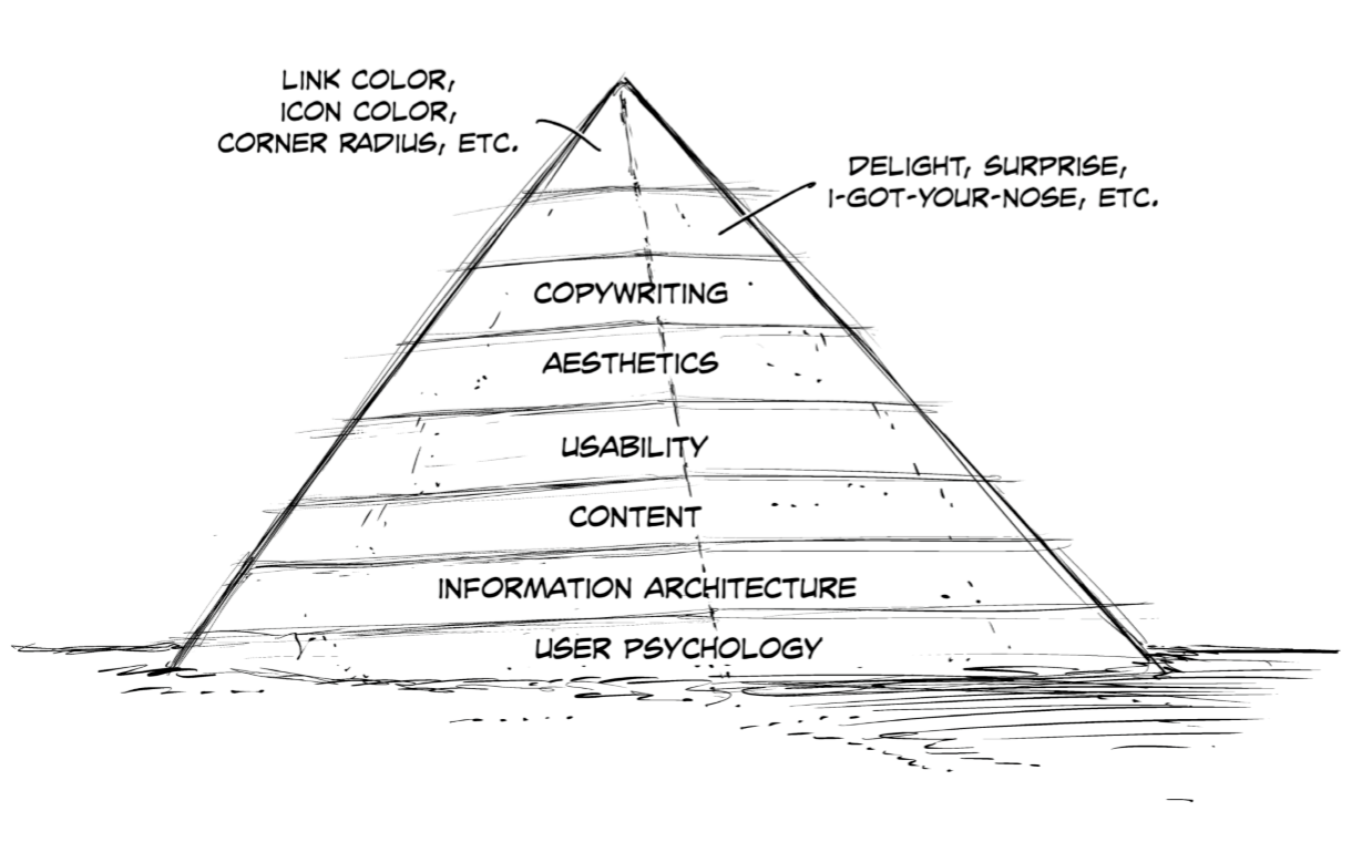
ইউএক্স শুধু বাটন বা অয়্যারফ্রেম* থেকে অনেক বেশি কিছু । ডিজাইনের বা স্ক্রিণে যেসব জিনিষ দেখা যায় তা সমূদ্রে ভাসা বরফখন্ডের উপরের অংশের সাথে তুলনা করা যায় । মাত্র ১০%-২০% দেখা যায়। আর যে অংশগুলো না হলেই নয় বা সবচেয়ে গুরুত্বপূর্ণ তা’ বরফের পানির নীচের অংশের মতো, দেখা যায় না বললেই চলে ।
ইউএক্স ডিজাইনার হিসেবে তোমার কাজ হলো ব্যবহারকারীর জন্য “উপকারিতা বা ভ্যালিউ তৈরী”** করা । ইউএক্স পদ্ধতির কিছু অংশ বেশি ভ্যালিউ তৈরী করে আবার অনেক অংশ আছে যেগুলো খুব বেশি ভ্যালুউ তৈরী করে না । তাই তুমি যে পদ্ধতিতে সময় ব্যায় করছ তা ভেবে চিন্তে কর । পরবর্তী অধ্যায়গুলোতে তুমি বিভিন্ন ধাপ সম্পর্কে জানতে পারবে । এখন তুমি শুধু এইটুকুই জেনে রাখ যে, ক্রমপর্যায়ের বা পিরামিডের সবচেয়ে নিচের বা বড় স্তরটি সবচেয়ে গুরুত্বপূর্ণ । এই ধাপটি অগ্রাহ্য করলে তোমার প্রোডাক্ট সম্পূর্ণ অপ্রয়োজনীয় হয়ে পড়বে । এবং এ ধাপের জিনিষগুলো প্রায় দেখা যায় না বললেই চলে । পিরামিডের উপরের দিকের ছোট ছোট স্তুরগুলো, এগুলোতে তুমি যতই সময় আর শ্রম দাও না কেন খুব বেশি ভেলিউ বা উপকারিতা যোগ করে না । এবং এগুলোই সাধারণত দেখা যায় ।
*Wireframes – একটি ডিজাইনের খুবই প্রাথমিক স্তরের চিত্র । সাধরণত কাগজে হাতে চিত্র এঁকে এঁকে অয়্যারফ্রেম তৈরী করা হয় যাতে খবু সহজে, কম খরচে, যখন-তখন, যেখানে-সেখানে বার বার তৈরী করা য়ায় । এর উদ্দেশ্য হলো কোন ডিজাইনের অনেকগুলো আইডিয়াকে তাড়াতাড়ি তৈরী করে পরীক্ষা করা । পরীক্ষার পর পরই যাতে নতুন করে দ্রুত আরেকটি উন্নত সমাধান করা যায় সে ব্যবস্থা করা । যদিও ইদানিং অনেক সফটওয়্যারের মাধ্যমেও তা’ করা যায় । **Value – উপকারিতা; মূল্য; দাম ।